UIndy Brand Guidelines
Brand Overview
Every organization needs something to believe in, a greater purpose to stand behind. One way how we at the University of Indianapolis articulate this purpose is through our brand, which is an expression of who we are as a university – what we value, what we promise and what differentiates us from the pack.
We encourage you to use this guide to discover how to bring to life our University brand through our images, words, creativity and courage to be different in this crowded and noisy world. Together we can create and nurture a brand that benefits and truly shines from that synergy. We created this branding guide precisely for that purpose, and we stand behind you in your efforts to promote and elevate your goals. We endeavor to customize those elements to your advantage and communicate the message you want to deliver.
This guide provides a number of resources and files to ensure proper use of certain elements. You’ll find color swatches, typography, graphic elements, photography treatments and more.
Elements outlined within are subject to change.
How could we, as a university, define what is unique, what differentiates us from the pack – what is our “UIndy effect”?
The University of Indianapolis established a brand position, aligned with concepts that support the essence of our organization.
3 Support Pillars
- Elevating Community
- Atmosphere of Invention
- Stimulating Social Good
Elevating Community
Hearkening back to our United Methodist roots nearly 120 years ago, the University of Indianapolis embodies a culture of “open hearts, open minds, and open doors.” Our students, faculty, staff and alumni foster a sense of family. Framed by a liberal arts core, students are enmeshed in an environment that champions critical thinking, encourages creativity and digging into the complexities of our world to find solutions. A high level of faculty-student engagement yields valuable personal attention, often resulting in lifelong connections. Our University’s culture respects and celebrates all forms of diversity and thought, and students engage in the community both on and off campus.
Atmosphere of Invention
The University’s vision is driving transformational change. Tangible developments are bolstering the already fertile ground for opportunities and innovations. A hands-on, applied learning approach and professional focus serve as a springboard accelerating growth and development at all levels. Faculty bring valuable, real-world experience, flexibility and skill to meet the needs of a wide array of learners. Our programs develop the creative, critical thinking, problem-solving and communication skills graduates need to be successful.
Stimulating Social Good
With exceptional programs, the University of Indianapolis delivers oversized impact on both an individual and societal level. The University of Indianapolis is a major contributor to the city and the state through economic impact, education, research, and public health efforts. The Stephen F. Fry Professional Edge Center facilitates meaningful connections between students and employers. We maintain an unwavering commitment to fostering a service-oriented culture that instills a lasting sense of shared responsibility in our students, faculty and staff.
Copy Tone
A positioning statement is complemented by tonal words that reflect the personality of an organization. At the University of Indianapolis, while our tone shifts depending on the audience, we are consistent across all communications—from digital to social media posts to print materials —emphasizing or understating depending upon whom we’re addressing.
- Welcoming
- Curious
- Genuine
- Dedicated
- Passionate
- Unifying
Our brand rationale defines who we are as a university. The more familiar we are with this, the easier it will be to create truthful and compelling messages.
While “endless possibilities” and “unlimited curiosity” are a good start, that shouldn’t be where college education ends. At the University of Indianapolis, our mission is bigger than that. It’s been bigger than that since we first opened our doors over 100 years ago. We follow through, so students not only discover their potential, but also a sense of purpose. With focus, we prepare students not just for real life, but to make a real difference in the real world. To be nimble on their feet, and to push forward through challenges. It’s the honesty of authentic value and genuine preparedness that rings true for our community—nearly 42,000 strong—of students, faculty and alumni.
Here, students open themselves up to become more of who they truly are.
While our brand has one clear voice, the groups of people who interact with us are varied. To help understand who they are, and how we reach them, we’ve placed them into three groups.
Primary
- Prospective Students & Parents (Undergraduate)
- Graduate, Adult Learning, Non-degree
Secondary
- Internal (Current Students, Faculty, Staff, Administration & Trustees)
- Parents
- Alumni & Donors
- Influencers (Guidance Counselors, Superintendents, Thought Leaders)
- Media (Local, Regional, National)
Tertiary
- External Community (Neighborhood residents, City of Indianapolis, Region)
- Prospective Employees & Partners
- Peer Institutions, Practitioners, Legislators, Businesses & Organizations
- Vendors
Our brand contains the characteristics through the use of tonal words. The most effective way to think about these words are as personality traits placed on an equalizer that lets us “dial up or dial down” based on the audience.
Throughout this guide we offer examples on how to reach specific audiences from a tone, typography, color, photography and graphic element perspective.
The University of Indianapolis brand is about a community growing and building momentum together, empowering, activating and inspiring each other to follow through on potential with purpose. Our brand voice echoes these sentiments.
Language is evocative, welcoming, aspirational and always purposeful. Our content and copy should follow the brand tone: warm, genuine language that is simple and direct while still being aspirational. The copy itself should entice the reader to see themselves in the sentiment, engaging them on the journey.
While a well-functioning brand has one clear voice, the constituencies who interact with it are varied. Without being implicitly stated, our tone words [WELCOMING, CURIOUS, GENUINE, DEDICATED, PASSIONATE, UNIFYING] underpin content and copy for these various audiences, and can be dialed up or down, depending on the audience.
UNDERGRADUATE EXAMPLE [WELCOMING, PASSIONATE, CURIOUS]
“You’ll share in more than 100 events each year, featuring renowned speakers, concerts, exhibitions and dramatic productions. How you live defines how you’ll learn as a Greyhound. Because this isn’t just your time to prepare. It’s your time to discover.”
GRADUATE/ADULT LEARNING EXAMPLE [WELCOMING, PASSIONATE, DEDICATED]
“You want to move forward. And when it feels like you’ve hit a ceiling, we help you break through.
We help workers in all careers through accelerated and traditional formats, including online classes. A variety of continuing education programs offered through The Division for Professional Engagement can help you pursue professional and personal interests.”
ALUMNI/DONOR EXAMPLE [GENUINE, UNIFYING, DEDICATED]
“You are never alone as a University of Indianapolis alum. The degrees we share go beyond school pride, or colors or mascots. We share a set of values, a commitment to making the world a better place to live, work and play. It’s who we are. It’s why we come through for each other. And it’s why we stay engaged and informed.”
*Note that the language for addressing specific audiences will continue to undergo refinement. For more detailed, up-to-date guidance on communicating with specific constituencies, please refer to the Brand Strategy document and Language Guide.
Headlines are our first and best opportunity to grab our reader’s undivided attention and get them to commit to the rest of the story. It’s important not to pack too much information into the headline or make it obtuse and confusing. Be focused yet intriguing. Headlines need to be straightforward – yet still push beyond the expected, using language that drives inquisitiveness and engages the audience to join in the discovery.
Examples
- CENTER STAGE.
TAKE IT. - MAKE YOUR WAY.
THEN LEAD THE WAY.
Typography
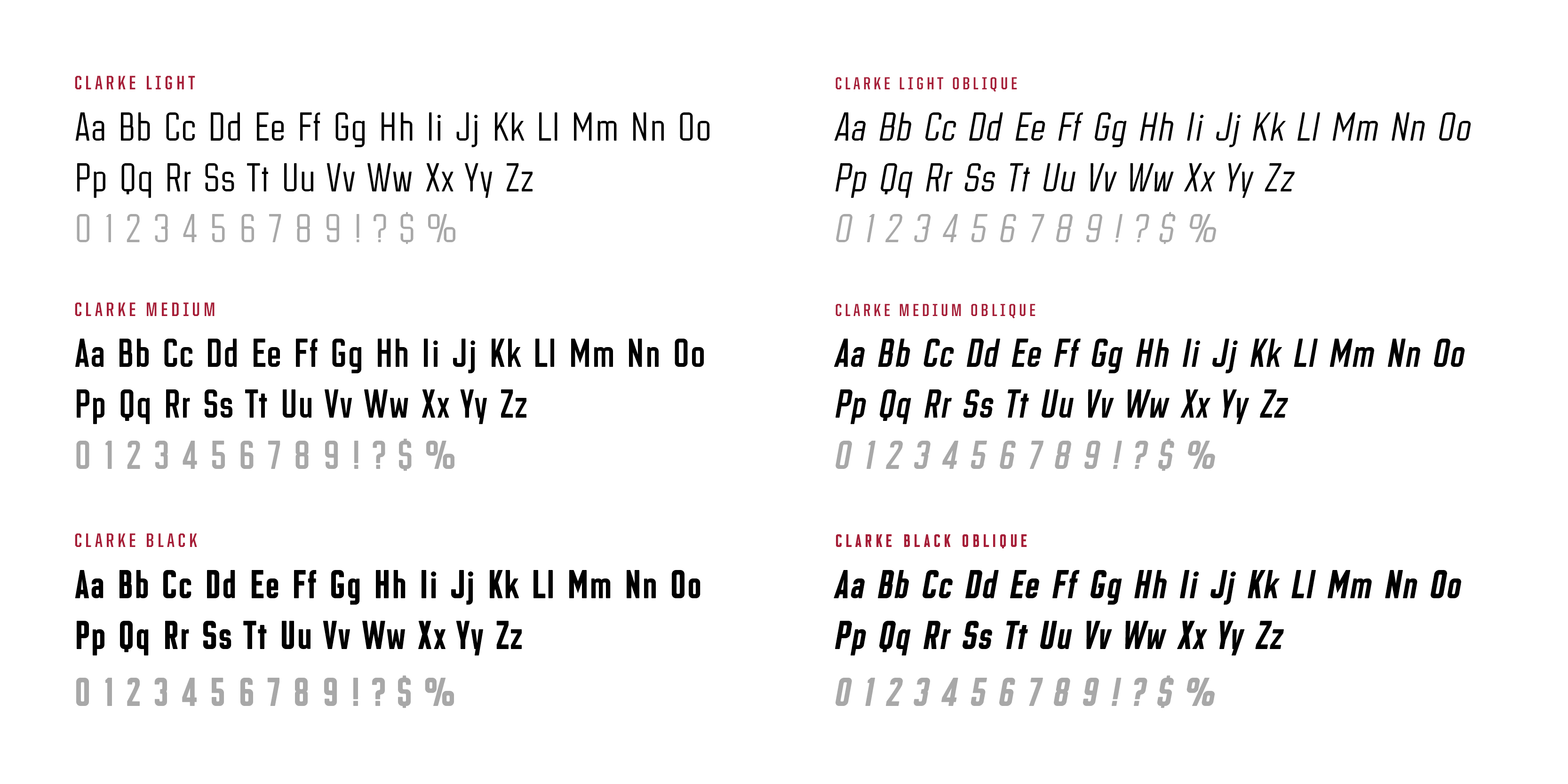
Clarke
This is the lead typeface of our brand and is used for headlines and sub-headlines. At first glance, Clarke is a proud condensed sans-serif typeface that feels bold, durable and honest. Upon further inspection, a warmer, inviting quality lies in the details of the subtle rounded tips and corners. This typeface was designed for headlines and subheadings and should only be used for these as the details are lost at smaller scales.
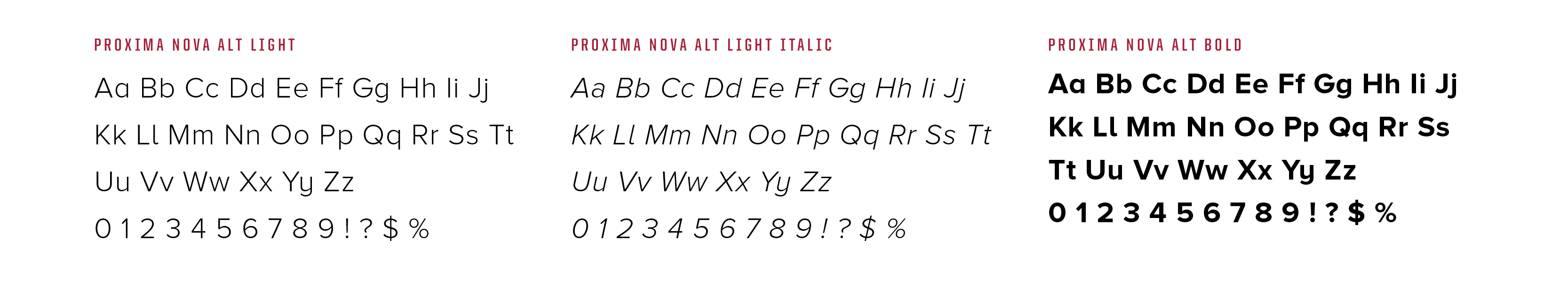
Proxima Nova Alt
Proxima Nova is a modern sans-serif typeface based on geometric proportions, contrasting with our headline typefaces. The typeface is flexible, complete with a full range of weights and italics, and is ideal for body copy and documents with more complex hierarchy.
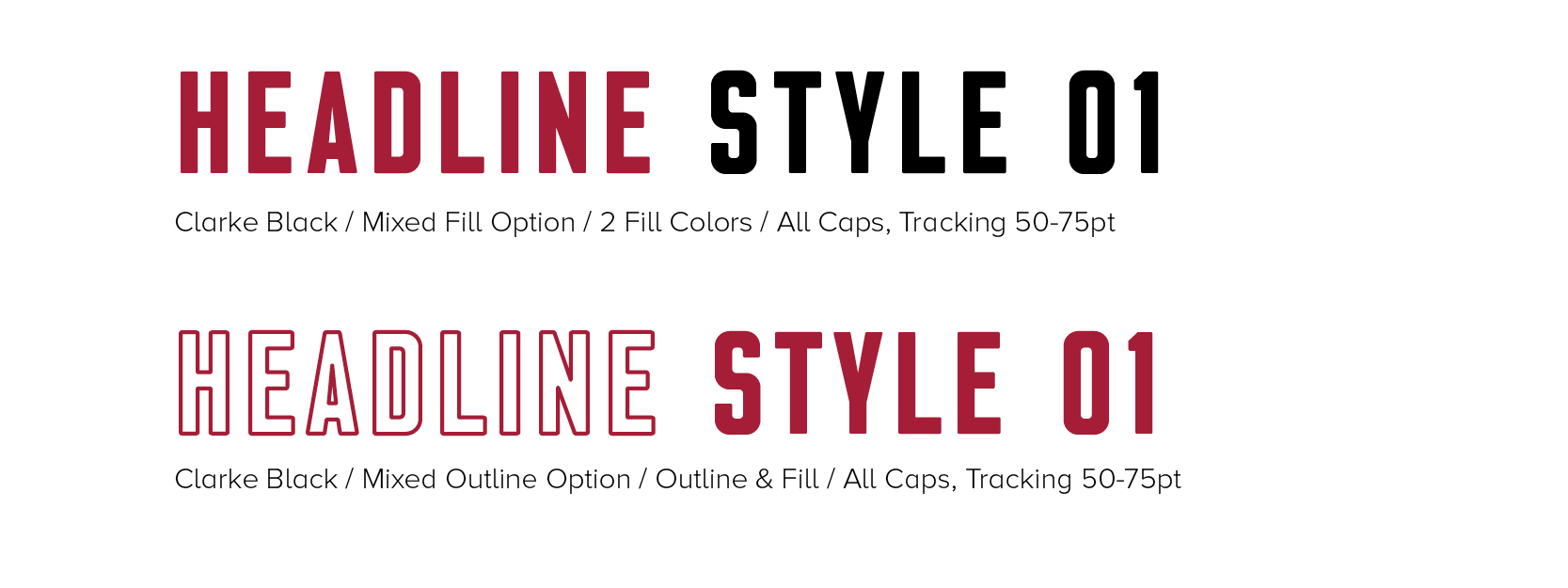
Clarke Black
At its simplest, a headline can be set in Clarke Black and offer bold and significant brand personality. When a headline needs emphasis on certain words, a mixed option can be used where individual words or portions of the headline copy are set in a different color or the solid and outline variations of Clarke Black. It’s best to set headlines in all caps and use an adequate amount of tracking to space out the letters (50–75pt, depending on the type size and available space).
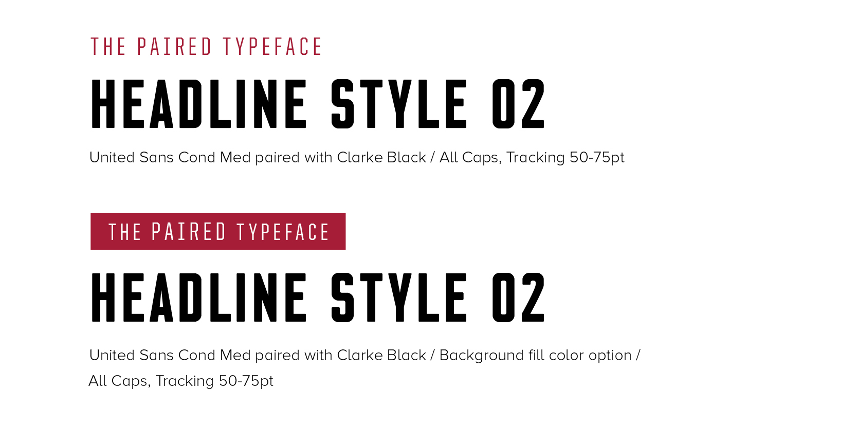
MIXED TYPEFACE - CLARKE AND UNITED SANS COND
This headline style is a more nuanced variation that works well for moments that call for contrast and variation within a headline. Headlines have lead-ins using the United Sans Cond type and contrast the larger, bolder Clarke Black typeface. A second version features a color bar behind the lead-in line to offer additional color and contrast to a layout. It’s best to set headlines in all caps and use ample tracking to space out the letters (50–75pt, depending on the type size and available space).
Setting type is a subtle art that reflects the brand. Guidelines contribute to legibility and continuity of our brand. Here are some general rules to keep in mind when laying out type for headlines or body copy.
Headlines are always set larger than the body copy and in the bold weight, which provides the most contrast from body copy.
Things to Avoid When Setting Headlines
- Do not create your own modifications to the font. Use only the faces provided.
- Do not track out headlines past 100pts. It becomes more difficult to read.
- Do not place the headline over a photo in such a way that the legibility is compromised.
- Do not vary the size of a specific weight or style within a headline treatment.
Things to Avoid When Setting Body Copy
- Do not track out the body copy more than 15pts. It will become spotty and difficult to read.
- Do not set body copy in all bold. It will become too dense to read at small sizes.
- Do not place the copy over a photo in such a way that the legibility is compromised.
- Do not set body copy in a weight other than light, regular, or medium for call-outs.
Branding Elements
WHY IS LICENSING SO IMPORTANT?
The University of Indianapolis’ name and marks are some of our most important assets. They immediately identify us to our community and help to tell our story. All members of our University community have a responsibility to protect and promote our brand in a manner consistent with our reputation for academics and service.
The University of Indianapolis Trademark Licensing Program helps protect and promote our brand by ensuring that the public can properly identify and associate the University’s name and logos with officially licensed products that have been approved by the University.
The University requires that all members of the University community (faculty, staff, students and alumni), as well as all external manufacturers and vendors, obtain approval before producing any product that displays the University of Indianapolis’ (UIndy) name and/or logos.
WHAT DO LICENSING PROGRAM REVENUES SUPPORT?
Licensed manufacturers must pay a royalty to the University on the sales of any product bearing UIndy trademarks. These resulting revenues help support the mission of the University. Although sales directly to the University are exempt from the royalty policy, any such sales and/or products must be from a licensed vendor.
WHAT QUALIFIES AS A TRADEMARK?
Any logo, word mark, nickname, verbiage mark, series of letters or acronyms associated with the University of Indianapolis distinguishable from those of other universities, teams, mascots or organizations are protected under UIndy’s trademark licensing program.
University Seal
The University Seal should be reserved for use in official University communications and for presidential correspondence.

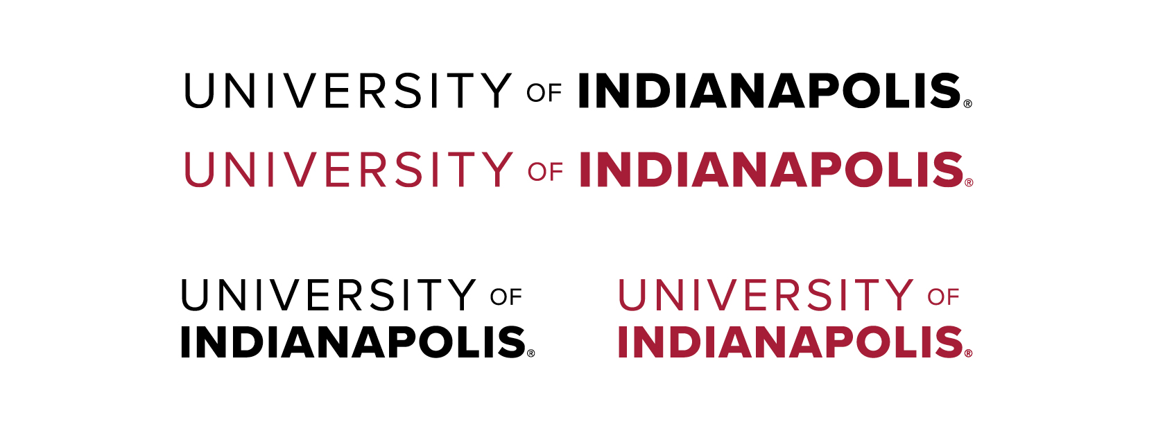
University Wordmark - Primary
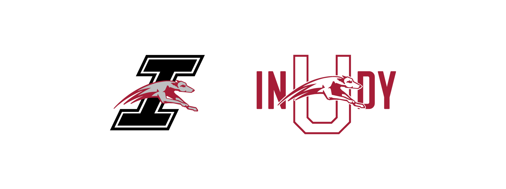
University Athletics Marks
University Wordmark - Alternate
The UIndy alternate wordmark shown is appropriate in smaller space applications where the primary wordmark or alternate leaping hound wordmark cannot be applied.
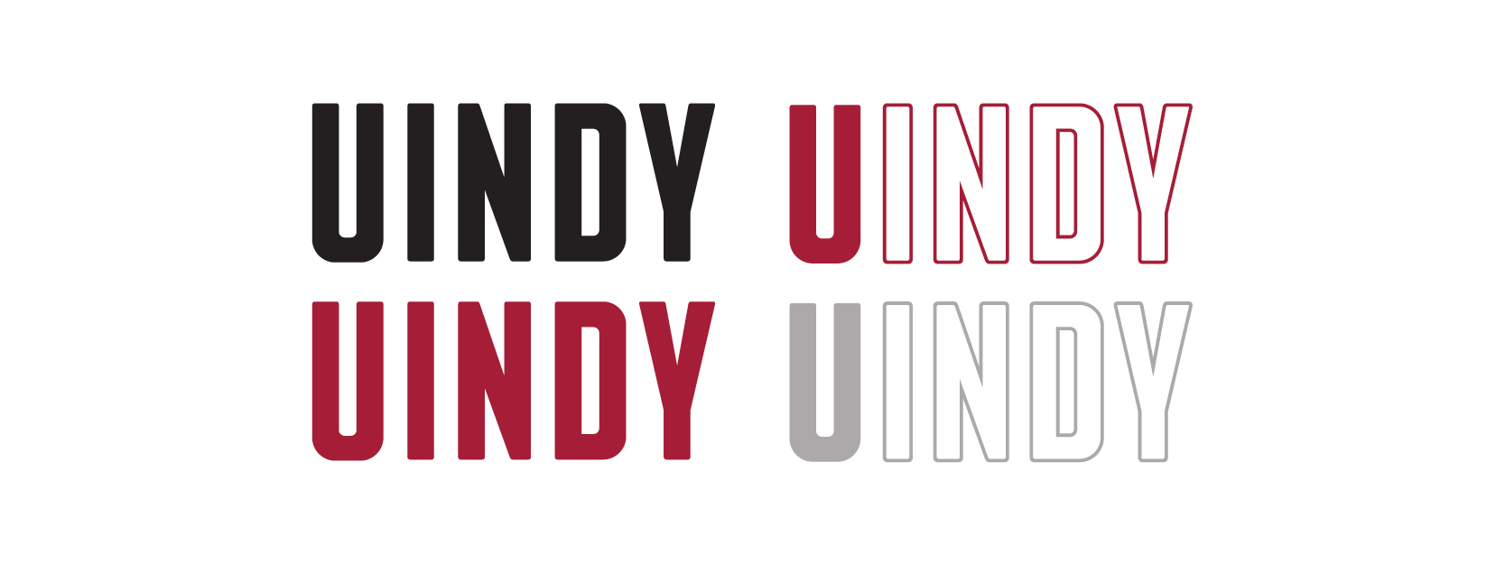
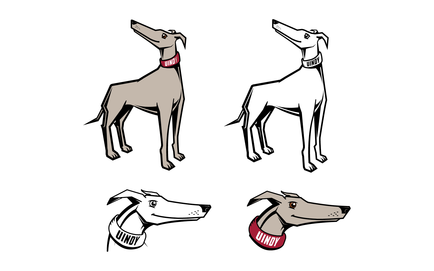
University Wordmark - Alternate “UIndy” Leaping Hound
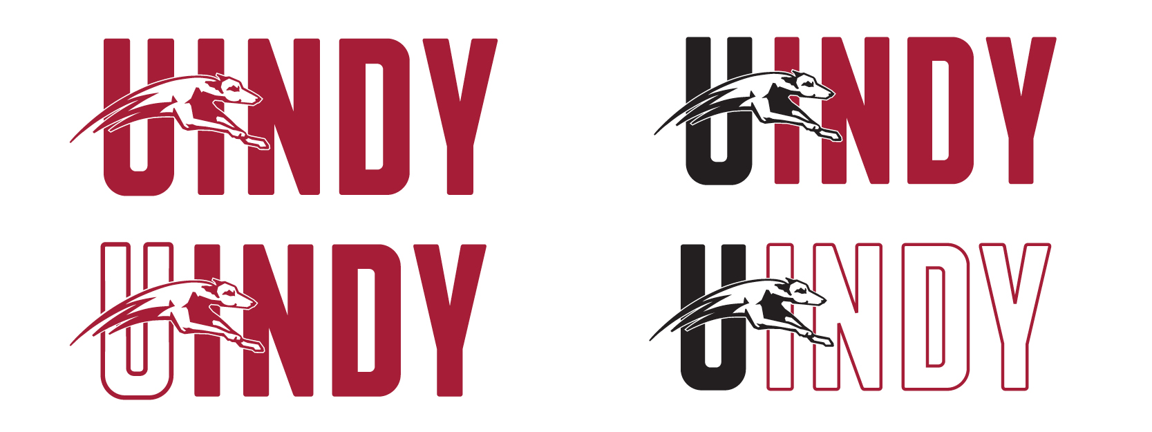
University Grady Illustrations
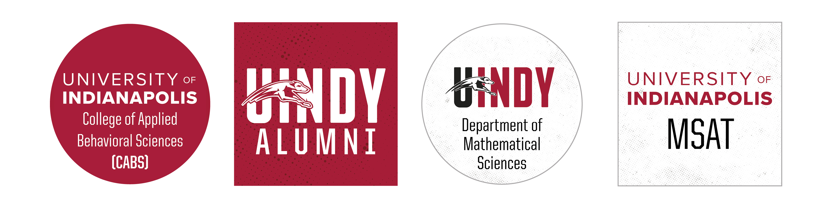
What is a branded house?
The University is a branded house. We have one primary word mark style that is the umbrella and several house brands beneath consisting of our departments, colleges, schools, and programs. See example to the side for how house brands should be utilized with our Primary University Word mark.
Why is brand consistency important?
Brand consistency ensures that our brand is easily recognizable across all marketing efforts. This creates a strong brand identity so existing and potential customers have a consistent and memorable experience with our brand. It promotes a feeling of stability when viewers consistently see a brand mark they can recognize and relate to our University. They can immediately say, “Oh! That’s UIndy!”
![]()
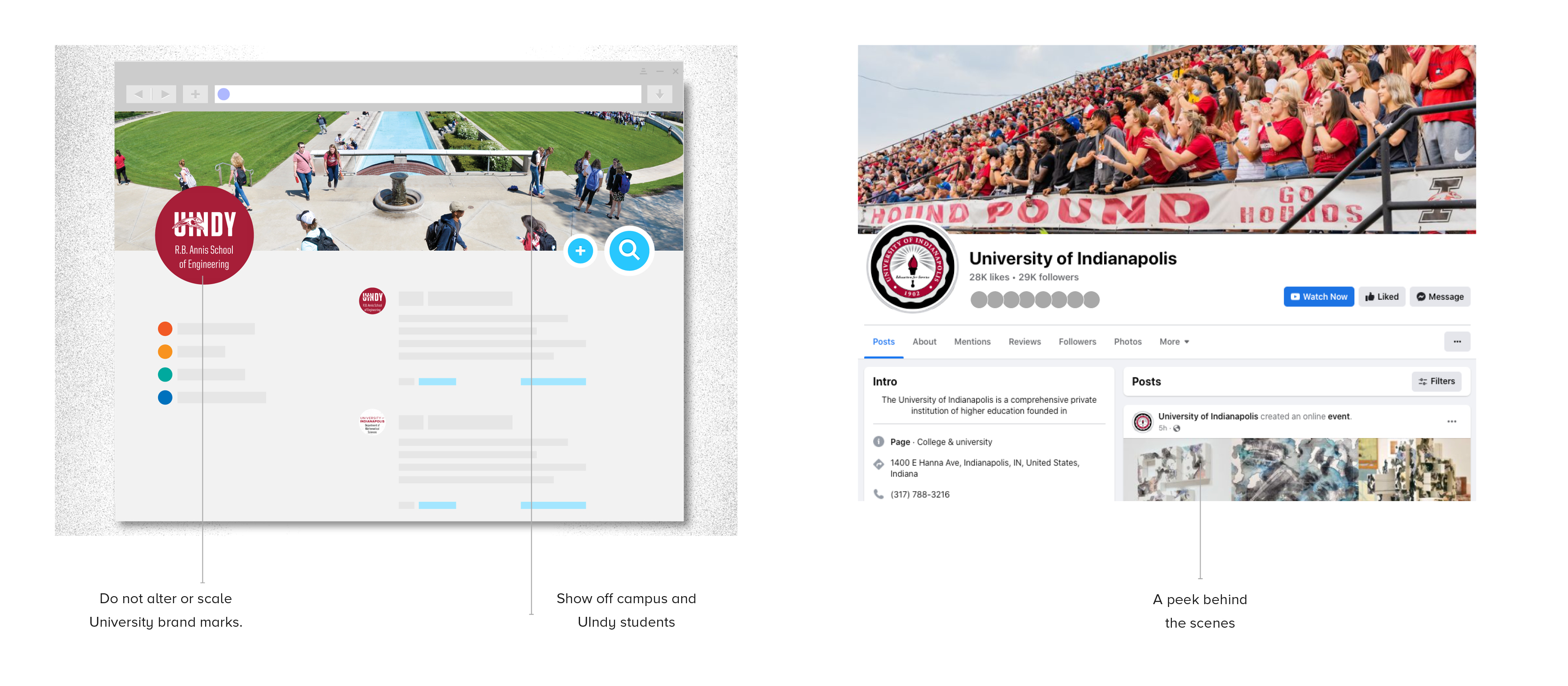
UIndy Social Media Profiles
Unification of our brand under the primary word marks is necessary to ensure that all viewers know exactly who they are dealing with. It creates a strong brand presence on social media. Our brand is the most identifying characteristic which determine how people feel about our organization. We are being proactive in our effort to influence this feeling with our design, marketing and other (social) communication.
Primary Palette
The primary UIndy colors are the foundation of the brand and should always lead the design.
-
PMS 201- CMYK — 24, 100, 78, 17
- RGB — 164, 31, 53
- HEX — #B20A38
-
PMS COOL GRAY 6- CMYK — 35, 29, 28, 0
- RGB — 169, 168, 169
- HEX — #A9A8A9
-
PMS COOL GRAY 9-
CMYK — 55, 47, 44, 10
-
RGB — 119, 119, 121
-
HEX — #77777A
-
-
PMS BLACK-
CMYK — 0, 0, 0, 100
-
RGB — 35, 31, 32
-
HEX — #1A1A1A
-
Secondary Palette
The accent colors work in conjunction with the primary colors, but should only be used in small proportions.
-
PMS 1795C- CMYK – 9, 98, 93, 1
- RGB – 217, 39, 46
- HEX – #d8262e
-
PMS 3945C-
CMYK — 3, 16,87, 0
-
RGB — 247, 206, 60
-
HEX —#f6ce3c
-
-
PMS 299C-
CMYK — 100, 33, 27, 2
-
RGB — 0, 125, 164
-
HEX — #007da4
-
HanD-Drawn Accents / Arrows and Lines
Hand-drawn lines add visual interest to a design, acting as entry points into content, adding motion and emphasis to aspects of the design. The human aspect of the hand-drawn elements feels genuine and inviting, echoing the welcoming environment and culture at the University. This element is to be used as an accent rather than a primary visual.

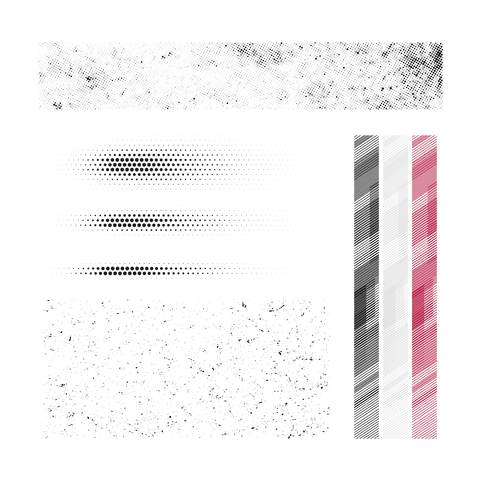
Texture
Similar to the hand-drawn elements, textures adds visual interest to a design and conveys the genuine and authentic qualities of the University, as well as adding graphic impact to bold brand moments.
Icon Patterns
The icon pattern is a background textural element that uses simple graphic language and words to convey a sense of history, place and pride across designs. The pattern can be used as a subtle background element in a light grey or tone-on-tone variation, or as a bolder graphic swatch, running off the edge or over a portion of the design.
The icon patterns convey University pride and energy, so it is also fitting that the pattern styles are adaptable to fit more specific areas and activities. Specialty icons are furnished upon request.
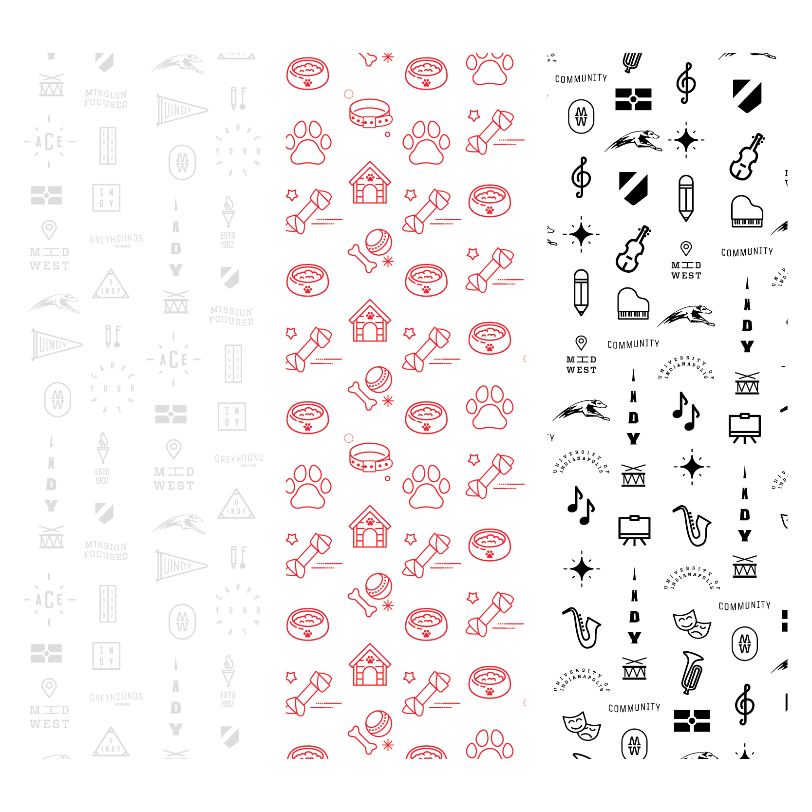
Icon Styles
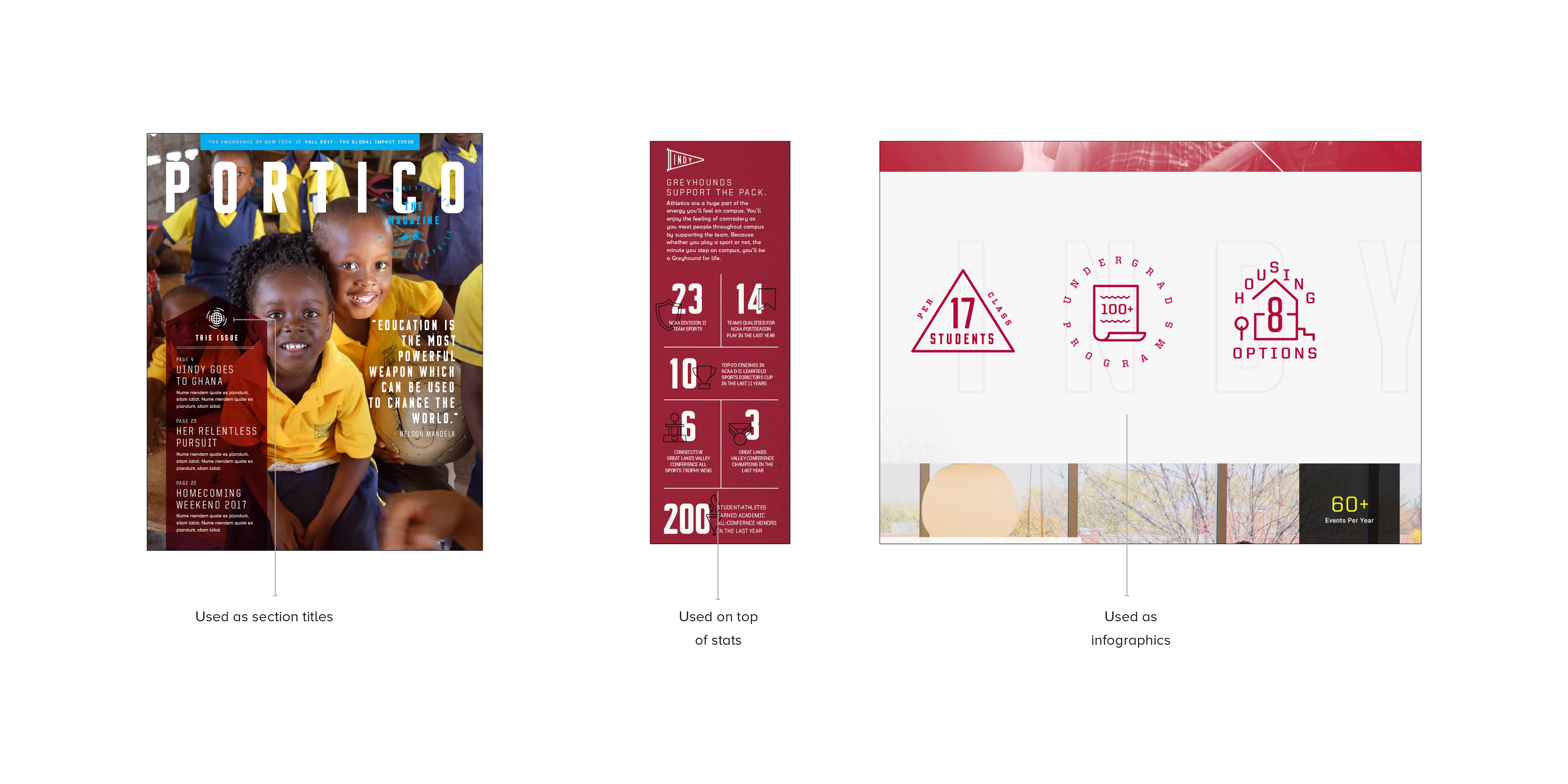
In addition to the iconography patterns, individual icon graphics can be used in a variety of ways. Icons help simplify complex ideas and add fun, memorable visuals to any message. These symbols can also be used in designs with or without accompanying text to modify the message. For example below, an icon is pulled from the iconography pattern and type is placed around it, transforming it into a section header.
Icons can be alternately used as an overlay accompanying a statistic. Icons should be kept simple, using mostly mono-weight lines and basic shapes for a quick and easy read. Our library of icons should continue grow over time.
Note: Each icon is a registered mark of the University and can only be used with prior approval.
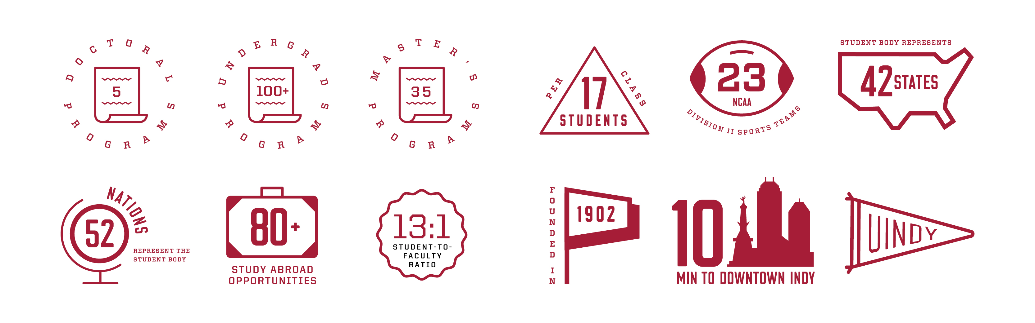
University Iconography
In addition to the iconography patterns, individual icon graphics are used in a variety of ways, such as University “points of pride.”
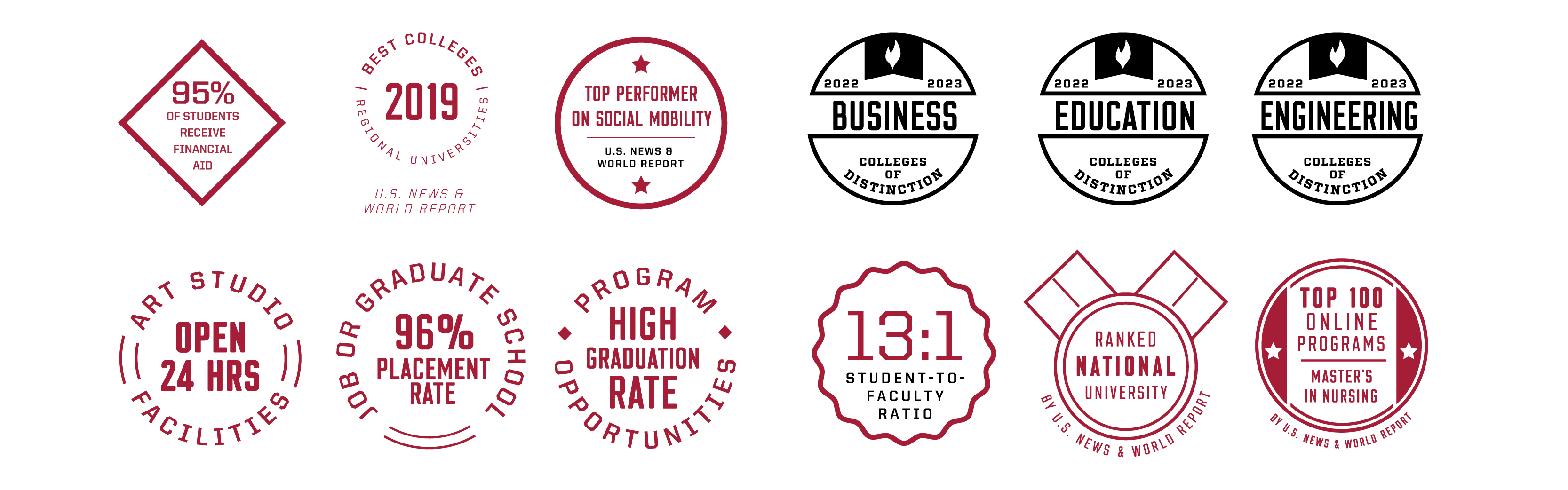
Badges
Photography/Videography
At the heart of the University of Indianapolis brand is our invitation to audiences to authentically connect with the UIndy experience. Our photography captures a sense of a passionate and inclusive community, an honest and genuine approach to education, and the growing momentum of the University within the city of Indianapolis.
Our photographic tone is:
- Welcoming
- Curious
- Genuine
- Dedicated
- Passionate
- Unifying
Graphic photo treatments enhance the photography and provide additional depth to the brand.
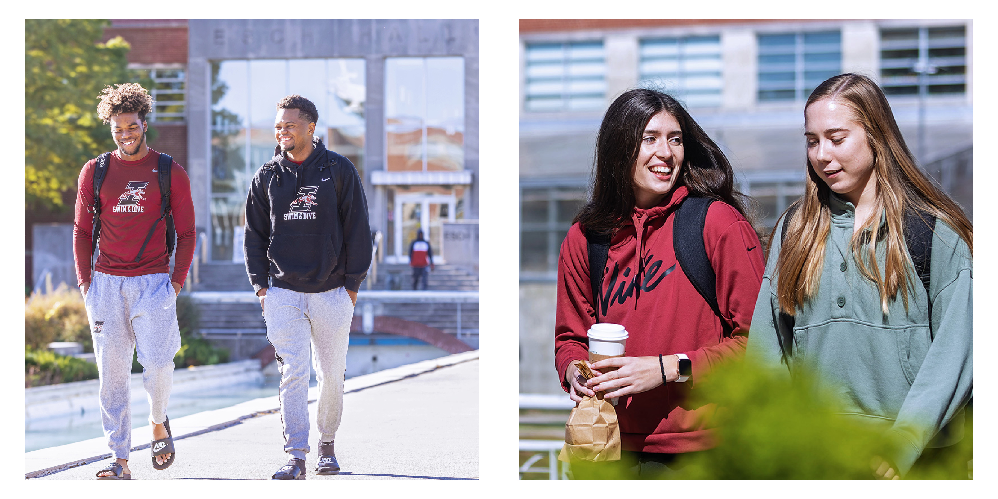
People
Capture students, faculty and alumni in a way that feels vibrant and authentic. Use the architecture and background elements to support and highlight subjects. Our photography reflects inclusivity of age, race, gender and ability.
We are academically driven and our environment is also a place of energy and spirit. Our images are bold, compelling and often feature a hero image that connects with our audiences.
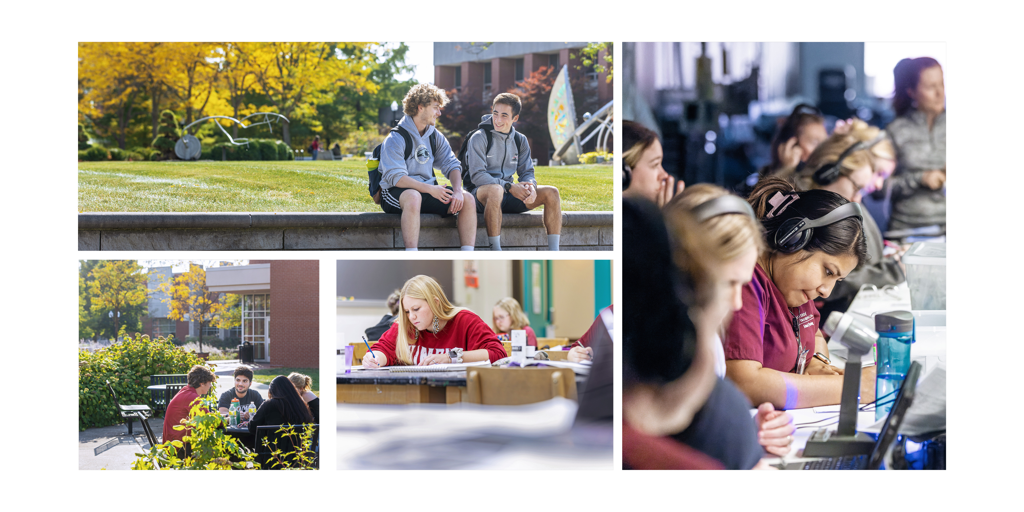
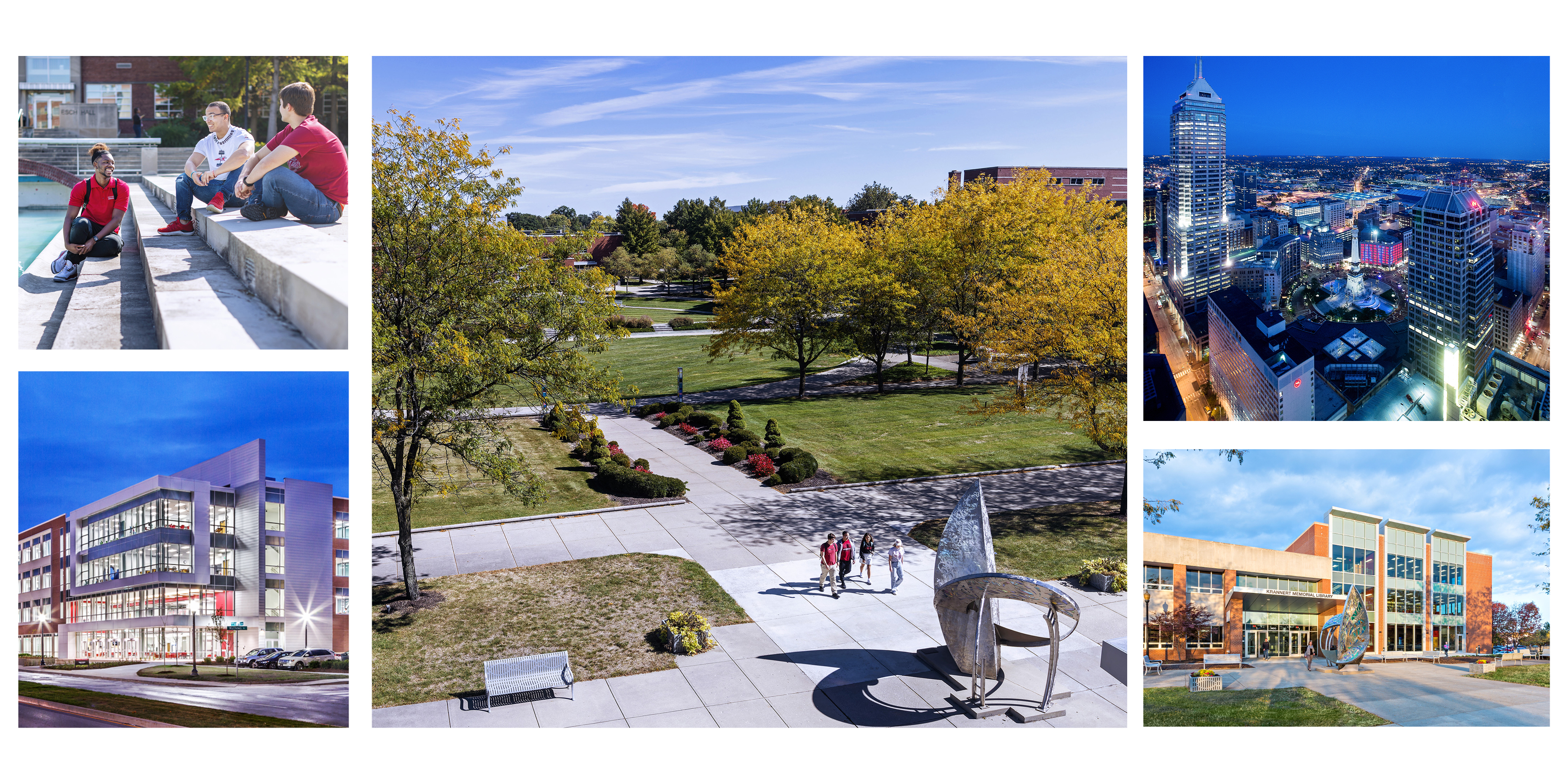
Campus/Environment
Our size and challenging, yet supportive atmosphere creates a connected community that extends out from campus, throughout the Capitol City of Indianapolis. Our photography conveys a sense of possibility and warmth. Around campus and in classrooms, we use varied perspectives to highlight textural moments that support the UIndy effect. Consider both wide landscape and tight detail crops with unique angles and out-of-focus foreground/background elements that can help draw the audience eye to the subject.
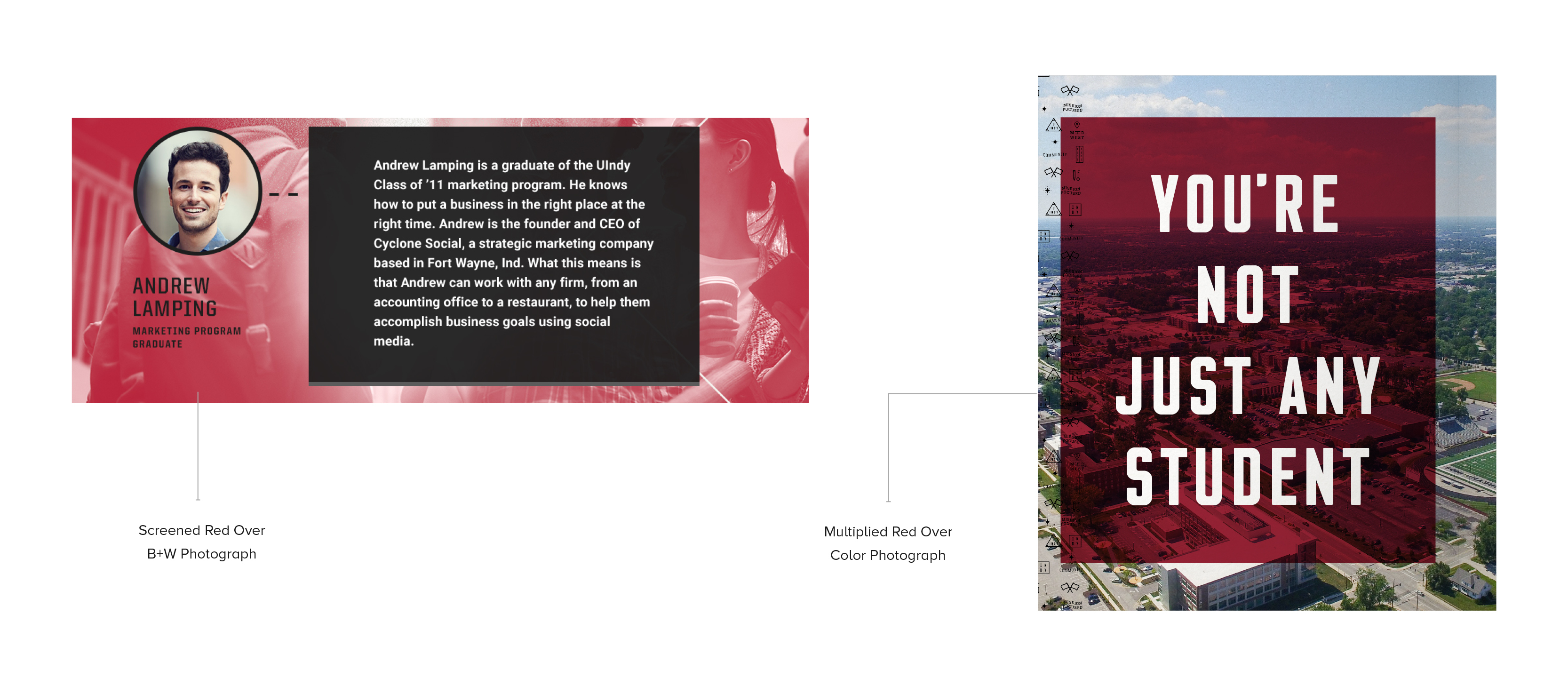
Color Overlay
Color overlays are used for graphic impact moments in which a sense of excitement and graphic punch are needed. This treatment works well when type is set over a photograph, adding legibility to a headline, or to tie in the brand look and feel to photos.
In today’s fast-paced media environment, video is an important and powerful communications tool. A well-made video captures the essence of a subject or idea and brings it to life with emotional storytelling and compelling imagery. University video elements help maintain a level of visual consistency among videos from across campus.
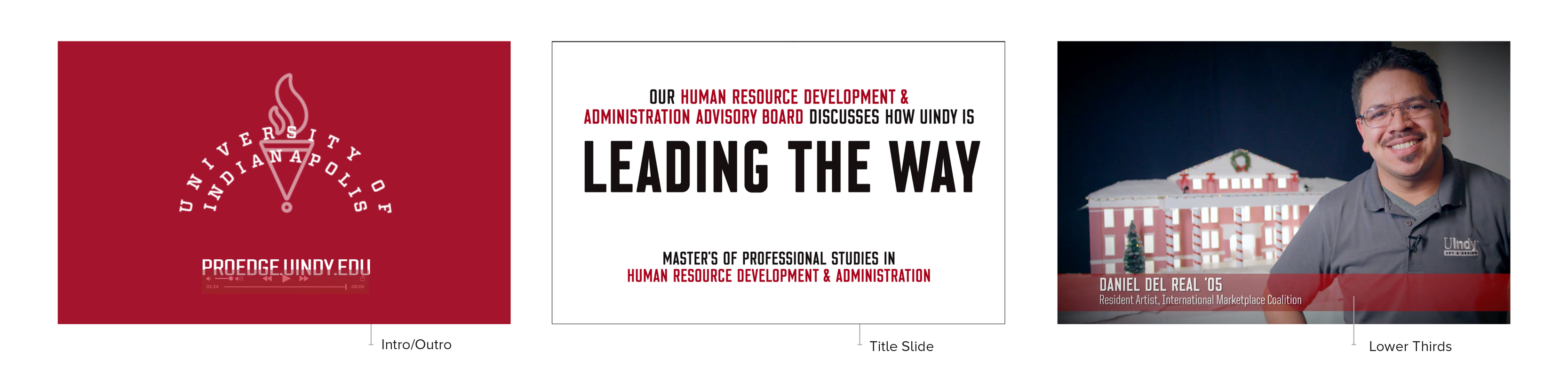
INTRO & OUTRO
Use University of Indianapolis logo animation at the beginning and end of the video.
TITLE SLIDES
Our goal is to get to the video as quickly as possible. If you’d like to use a title in the beginning, add it to the name logo intro slide. Do the same if you’d like to add a URL at the end. Titles should subtly fade in and fade out and should be in our standard title font: Clarke Combo Bold in all caps.
LOWER THIRDS
- Use lower thirds only for subject identification.
- Use lower-third IDs on the subject’s first speaking appearance. Identify each subject just once.
- If a subheading, such as a title or department name, is too long to fit on one line, reduce the point size and run it over two lines.
- Lower-third IDs are positioned on the bottom-left side of the frame.
- Lower thirds should be in all caps in Clarke Combo Bold.
Best Practices
- A tripod and external microphone go a long way in producing a quality video.
- Lighting is a key component of any quality video. Good lighting will keep your images crisp and in focus. If you don’t have access to a lighting kit, try to shoot outdoors or in a well-lit interior space.
- Always keep the composition of the frame in mind.
- Videos should be shot in high-definition whenever possible.
Social Media
Social media is a powerful communication tool. Every University of Indianapolis-related account plays a crucial, integrated and supportive role in telling the University’s story.
Through an integrated strategy, the Office of University Communications & Marketing uses social media to engage with a global audience, including current and prospective students, faculty, staff, alumni, parents, external media and local community.
We start with the message, identify the audience and work with you to determine the most effective communication channel(s). And while we are at it, we keep our eye on the impact, audience reaction and reach. We can help you develop a clear, effective and engaging strategy for using social media and emerging communication technologies to achieve your goals and advance your priorities.
Social media relies on photos, videos and graphics to connect with audiences and engage them (likes, comments, shares, retweets, and clicks).
Contact: socialmedia@uindy.edu
A few guidelines and best practices:
- Be confidential. Be careful not to reveal confidential or proprietary information about University of Indianapolis students, employees or alumni. Adhere to all applicable University, federal and NCAA privacy and confidentiality policies. All employees of UIndy are subject to FERPA, HIPAA and other laws mandating the nondisclosure of personal information.
-
Protect property. Follow copyright, fair use and intellectual property rights. In some cases, content posted to a social media site becomes the property of the platform operator. Also avoid copyright infringement by not using images from search engines and other websites.
-
Protect the UIndy brand. Official logo and seal images should not be stretched, distorted or modified in any way. The University of Indianapolis logo cannot be modified or used for personal endorsements, and the trademarked University of Indianapolis name cannot be used to promote a product, cause, political party or candidate.
-
Respect UIndy. Remain professional and in good taste, and protect UIndy’s institutional voice. This includes only posting appropriate photographs, images, .gifs and graphics.
What to photograph/snap?
Don’t just talk about what we have to offer our students. Show it off in pictures and videos.
- A peek behind the scenes. What makes your program unique?
- Remember action shots. How are students interacting with your program?
- Shine the spotlight on students. Remember to tag them on social media as well.
- Beauty shots of campus.
TIPS
- Tag every photo you take with your subject’s hashtag and the #uindy hashtag. If you forget, you can always add the hashtag in a comment on the photo.
- Consider adding popular and relevant hashtags to your photos to increase visibility.
- Always add a caption to your photos.
- Experiment with video. Remember to get the permission of anyone in your videos.
See current social media image sizes
Contact Info
Questions?
If you have any questions about how to use the brand guidelines, where to find elements, or any other concerns regarding the UIndy brand, please contact the communications department for further advice.
Garrison Carr
Associate Vice President of Communications
317-788-2136
carrg@uindy.edu